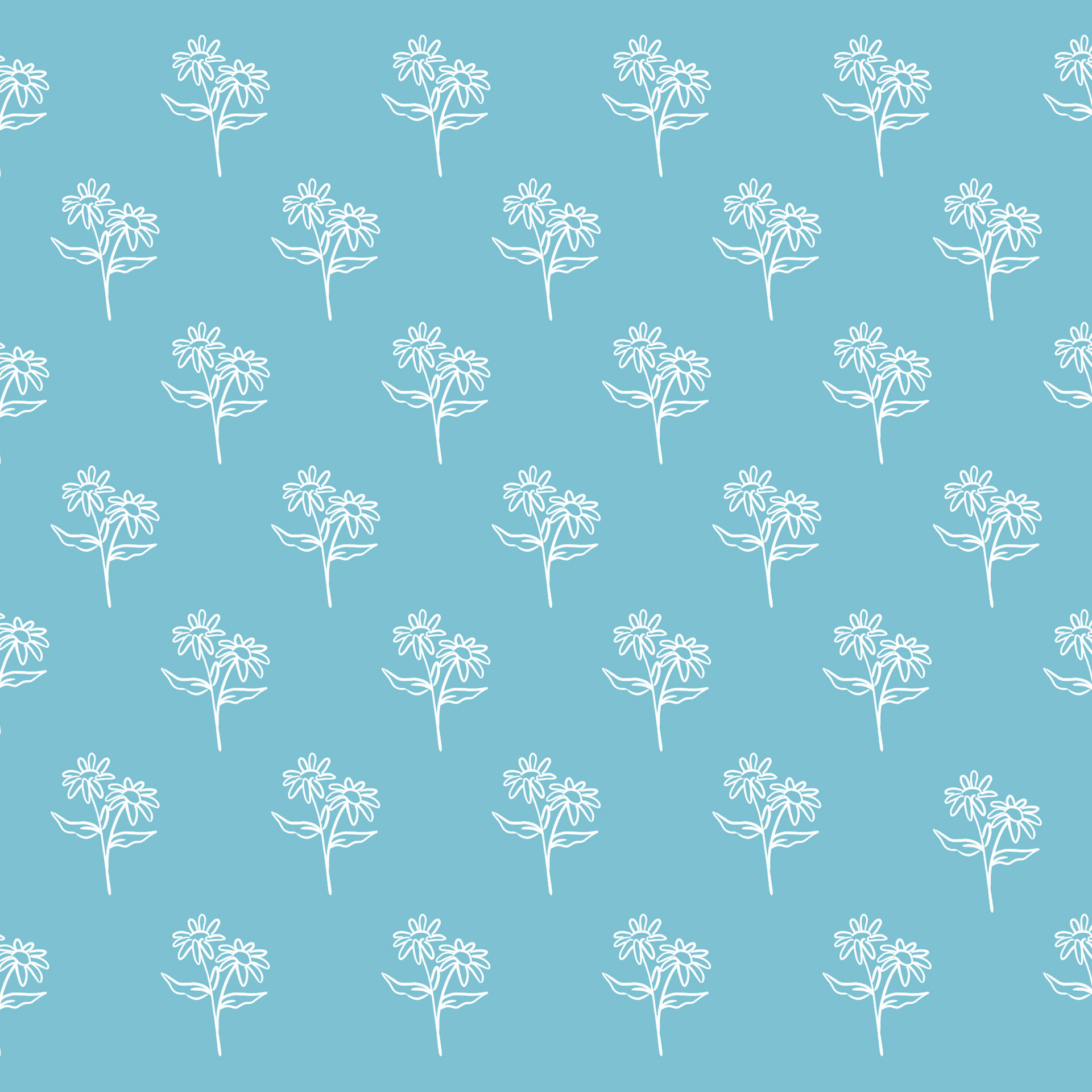
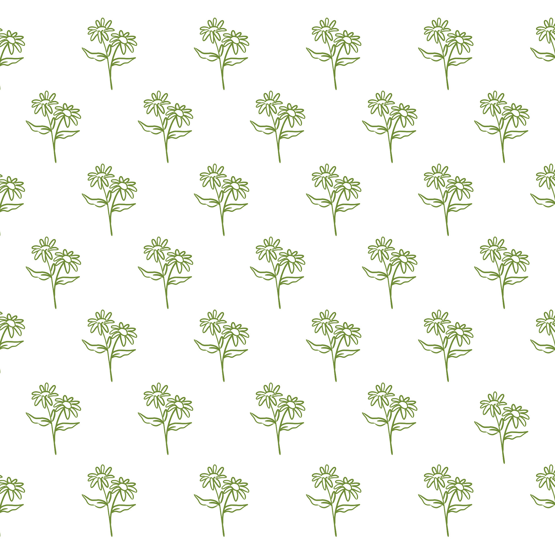
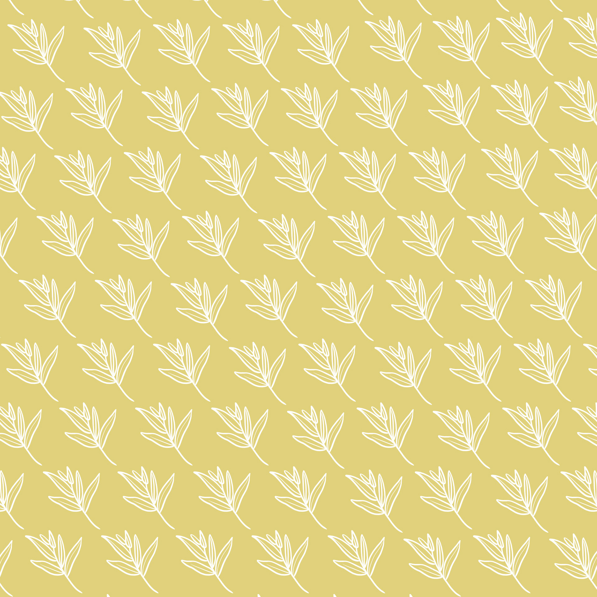
For the L'Herboristerie Bohême brand, I developed a comprehensive visual identity system that effectively captures the essence of this artisanal herbalist company based in the south of France.
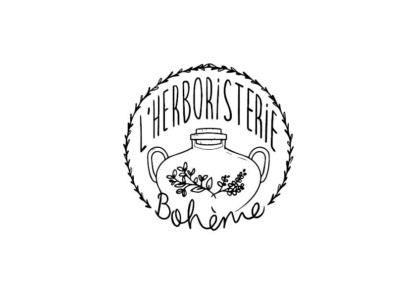
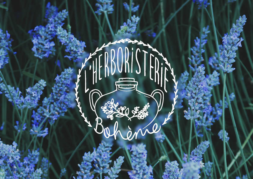
The core of the visual identity is the logo, which features a distinctive circular badge with an illustrated herbal motif. The central vessel icon, reminiscent of traditional herbal remedies, is surrounded by a wreath of stylized leaves and flowers. This iconic logo element can be used flexibly across various applications, from digital platforms to physical branding touchpoints.
The custom logotype, featuring a bespoke script-like typeface, complements the organic, handcrafted aesthetic established by the logo. The flowing letterforms convey a sense of artisanal craftsmanship that aligns with L'Herboristerie Bohême's focus on organic herbal products like soaps, teas, and sorbets.
The resulting visual identity system reflects the artisanal, organic, and authentic values that are at the heart of L'Herboristerie Bohême. Through the harmonious integration of the logo, typography, color palette, and botanical illustrations, the brand is able to effectively communicate its mission and connect with its target audience across various touchpoints, both digital and physical.
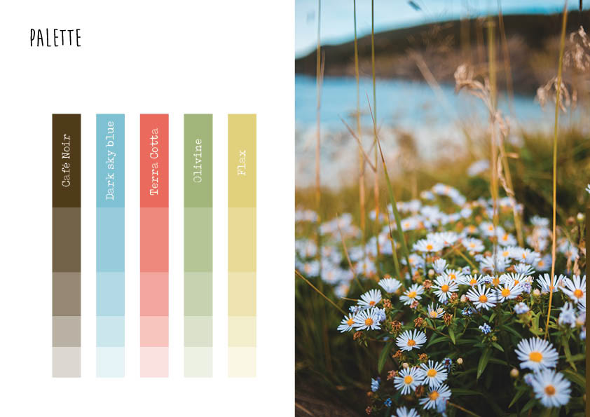
Beyond the logo and typography, the broader visual identity system includes a cohesive color palette inspired by the natural hues of the brand's products and the local southern French environment. Shades of blue, green, and earthy neutrals create a soothing, nature-inspired aesthetic that permeates across digital and print materials.
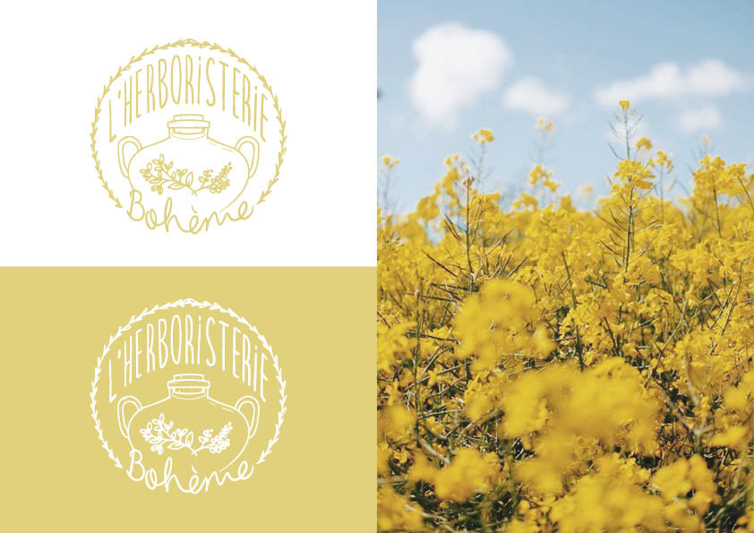
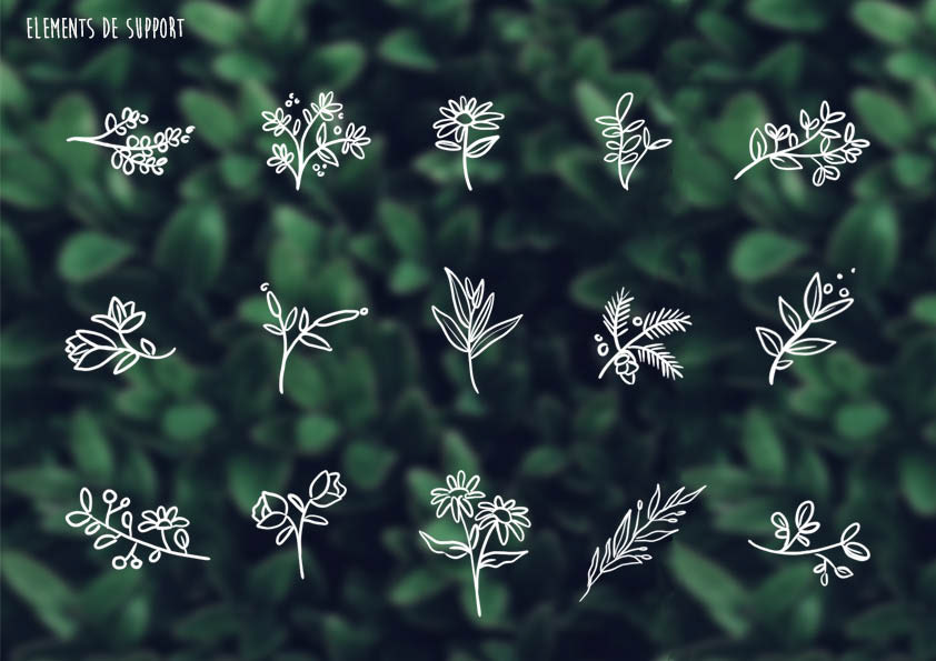
To further enhance the brand's visual language, I incorporated illustrated botanical elements, such as delicate leaves and flowers, that echo the organic motifs present in the logo. These illustrations can be used as decorative accents or as standalone design elements, strengthening the brand's connection to the natural world.